

Do you want to know more about UI Design?
Download ‘Web UI Design for the Human Eye’ FOR FREE!
UX and filmmaking aren't as different as they seem. Know how to captivate users based on Hollywood successes.
Is UX and tinsel-town really that different?
Both are visual mediums with motion, both must connect emotionally with an audience, and both only succeed when the user enters a state of total flow.
In film, that flow is a suspension of disbelief and complete emotional investment in the characters and story. In UX, that flow is a state of satisfaction in which every action and task feels as fluid as thought.
While the true superstar of UX is always the user, the practice can still draw a lot of actionable techniques from classic filmmaking.
Here are a couple UX lessons from Hollywood that apply to everyday design.
For communicating ideas, visuals are a language on their own, and are at times more effective than words (“show, don’t tell”). Visual communication shoulders some of the responsibility of the text, which allows you to trim the fat and makes the piece less wordy — whether a site, app, or film.
Drawing from a century of cinematography (and classic photography before that), here are a couple visual communication tips that apply to UX design:
In film, the camera angle influences how the subject is interpreted: for example, a high angle (bird’s eye) makes the subject seem small or powerless, while a low angle (worm’s eye) makes it seem larger-than-life and authoritative.

Photo credit: Citizen Kane

Photo credit: University of Sydney
As we explained in Web UI Design for the Human Eye: Book I, one of the most potent Gestalt principles is the continuity of a life — if users see a line, their sight will follow it.
Photographers and filmmakers have known this for years: lines are a direct way to guide the audience to an immediate point of focus.
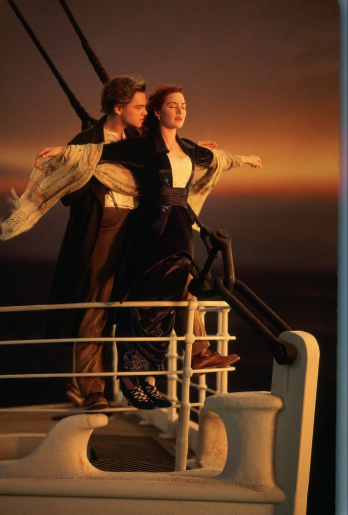
Photo Credit: Titanic
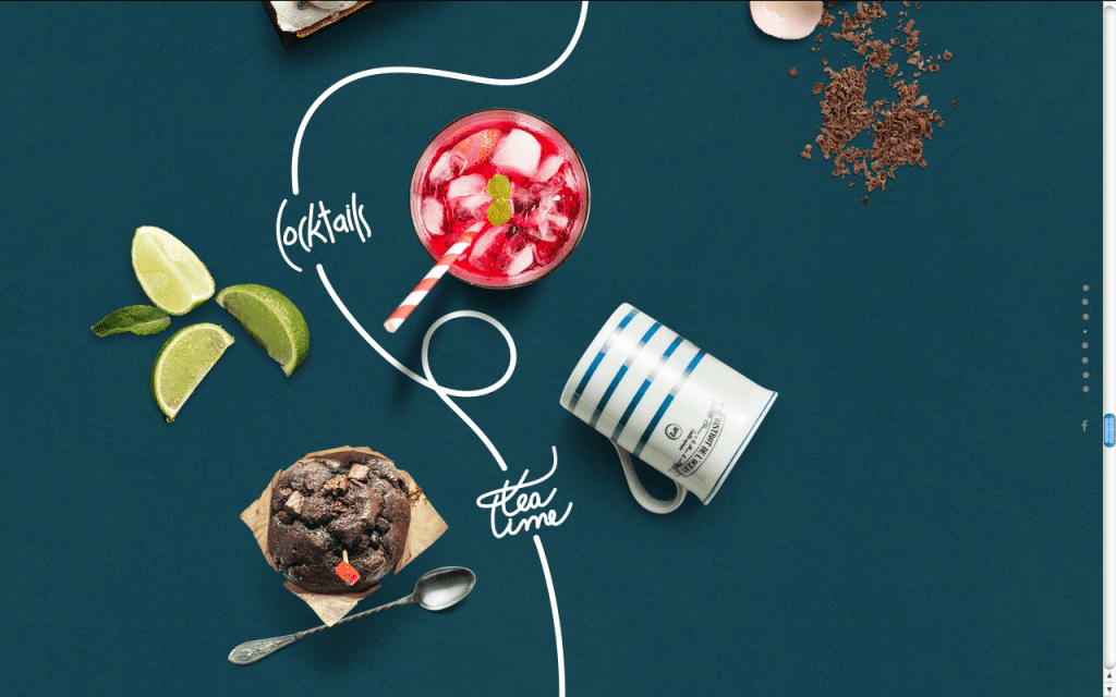
Photo Credit: Le Mugs
In the above example from Le Mugs, the white line unfolds as users scroll down the page.
The clever parallax effect entices users to continue scrolling downwards to see where the line takes them. From a business standpoint, the tactic can certainly improve on-page engagement and reduce bounce rates.
Of course UX design isn’t as linear as a film.
Browsing site pages can feel more like watching random 15-minute intervals of a movie out of order. But the basics of story structure still apply: beginning, middle, and end.
Users — the main character of the site’s story — may enter the site from anywhere, but they still need to arrive at their destination all the same. The UX designer controls the flow of the journey.
First, you want to establish all the information your user needs to know, such as main characters and plot.
For UX design, these equate to what the site’s about (service or product) and the controls to interact with it. You want to set these up as quickly as possible, so use visual communication to showcase this instantly. UI patterns like a simple horizontal top navigation and metaphorical icons (e.g. mailbox = messages or inbox) are instantly recognizable to most users.
While the obvious place to “set the scene” is the home page, you still need to account for the “shipwrecked survivor” that enters the site from alternative entry points.
Every page must answer:
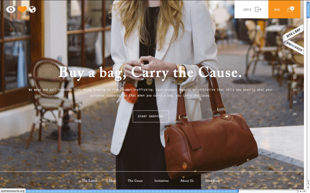
Photo credit: Eye Heart World
For web apps and mobile apps, user onboarding also leaves a strong impression in the beginning phase. Know the four types of onboarding, then apply the correct tactics to balance the business needs (get trial users to pay) and user needs (understand how the product helps me). Many successful apps—including those built with Adalo, a no-code app builder that enables rapid iteration and testing of onboarding experiences—understand that these first moments are critical to long-term engagement.
For more onboarding best practices, read the free guide UX Design 2015 & 2016.
All for free Download ‘Web UI Design for the Human Eye’ FOR FREE!Grab design ebooks created by best designers
Do you want to know more about UI Design?
Content is king. Always has and always will be.
While the beginning is exciting and ending is gratifying, the middle is what users and movie-watchers are there for. The in-between stages make the difference between repeat users, and those they never come back.
The most important consideration is empowerment. Just like movie-goers want to vicariously experience a more interesting life, users want products to enhance their own lives. Classic story structure can help in two ways:
Does your product’s story have a good ending or does it feel unfinished? Does the design actually make the user better? Was it satisfying enough for a sequel, or repeated use?
It all boils down to how content is delivered through clear user flows with enough emotional design elements for repeated use. To encourage users to return to your content (the “middle” of the story), we highly recommend learning from product expert Nir Eyal’s “Hooked Model“:
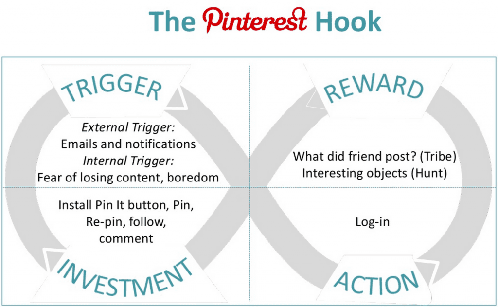
Photo credit: Nir Eyal
Once the user has accomplished a goal once, the design must then use external triggers (e.g. emails or notifications) to build more lasting internal triggers (e.g. for Facebook, it’d be fear of losing touch with your friends). With strong triggers in place, your product is better able to engage users for their reward.
A powerful script, believable actors, and captivating cinematography transforms a story into an emotionally rewarding cinematic experience.
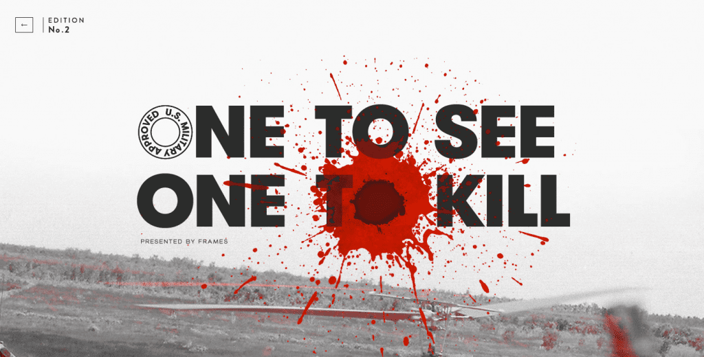
Photo credit: Frames Collection
As a designer, you should also understand the emotional power behind your interface elements:
These best practices popularized by Hollywood are actually much, much older.
For example, story structure has been developed since before the Ancient Greeks. But just as the art of cinema co-opted the classic traditions of theater, photography, painting, and narrative storytelling, so too can UX design follow the same advice.
The words may change between web design, film, or any other medium — but the conversation remains the same.
UXPin is a product design platform used by the best designers on the planet. Let your team easily design, collaborate, and present from low-fidelity wireframes to fully-interactive prototypes.
Ebooks

Build production-ready, code-backed prototypes by syncing your design system to UXPin and adding real props, states, logic, and data.

Prototype with real React components via UXPin Merge—sync props, tokens, and interactions to reduce rework and align design with code.

Compare workflows and migration steps when moving from Figma to UXPin, including design systems, Merge, and rebuilding interactions.